Packaging Design: The Opportunities of Accessible Design
Our population may be aging, but seniors are also a large and wealthy consumer group. A 2022 study published by the Fraser Institute reports Canada’s population of persons aged 65 or older went from 14% in 2010 to 19% per cent in 2022 and is expected to grow to 23% in 2030. Moreover, a Brooking Institute report cites that, seniors, along with professionals between 45 and 64 years of age, are the wealthiest age cohort in the world.
Many seniors are managing conditions associated with diminished strength, pain and the loss of fine motor skills. While aging takes place, they are looking for solutions that allow them to remain as independent as possible, managing their own lives and homes. Simply put, they don’t want to have to ask others for help.
New ideas based in accessible design principles can help.
Brands should take note that there is a strong market for targeted products that offer more accessibility. Living longer independently and having the means to pay for it, seniors will embrace adaptations that make everyday tasks easier.
Brands and their designer partners who decide to solve for the problem will not only be providing a great service. These solutions can also differentiate a brand and expand its market. And while recent trends in the packaging industry have looked to address sustainability and safety, the added challenge of packaging accessibility can create important innovations:
Making packaging bigger:
Consumers with arthritis or who struggle with fine finger movements don’t want to have to find the tiny edges of packaging openings. Just making packaging larger can help a lot. Serrated edges, notches, clearly marked places to cut or tear, larger print and clear ‘open here’ instructions can save time and frustration. Larger packages will help make resealable packaging easier to handle and provide more room for resealable zips and edges. Larger display surfaces also allow larger print to improve legibility of important information.

Improving legibility:
More legible messaging is critical for those with impaired vision, but this doesn’t end with simply larger type on the primary display panel. It is essential that all copy on secondary panels, including ingredient lists and usage directions can be easily read by those with impaired vision.
Using high-contrast colours makes it simpler to pick out specific words and designs. Typography is equally essential, as sans-serif typefaces are simpler for people having dyslexia or visual impairments to read.
Optimizing grip:
New easier grip handles on bottles or jars make them easier to hold while using or opening. Fingers can clutch indentations for a steady grip.
Under the Olay brand, Procter & Gamble has launched a new jar with a winged lid – the lid is raised for enhanced grip and includes a high contrast label and braille lettering for those with vision problems.

Making opening easier:
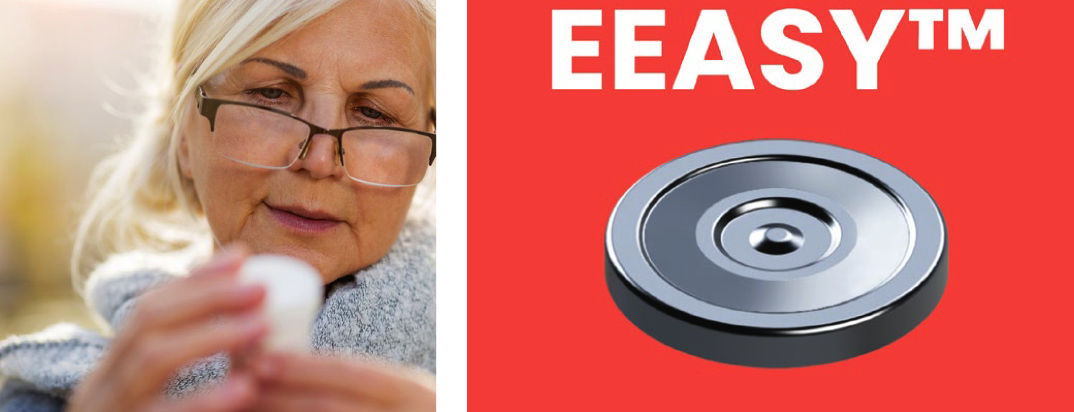
Pull rings are a struggle for weaker hands, but cans can be opened with old-fashioned can openers. The twist-off jar is here to stay but is made easier with designs like the Easy Open Lid, EEASY lid. The lid is 50% easier to open than traditional jar lids because of its reduced vacuum setting.
A button in the centre of the lid is pressed by the consumer to release the vacuum and make the lid easy to open. It can be pressed again to reset the lid and store the food item inside, avoiding any leaks or spills.

Selecting substrates:
Substrates impact accessibility. Paper or cardboard food packaging is more accessible than plastic. Items such as laundry detergent are more convenient to open when in a box rather than in a plastic container.
While safety has informed many product designs, there is a large market that would welcome the ease of more pliable, easier-to-cut substrates.

Product-specific solutions:
Some companies are re-inventing specific products for the accessibility market. Under its Degree brand, Unilever has launched a deodorant designed for people who have minimal mobility in their arms. The roller and the bottle were made bigger than in other deodorants, while the oblong shape of the container is intended to make the grip more secure.

Companies are increasingly recognizing the impediment of packaging that is difficult to read and open, resulting in frustrated consumers and lost sales. How can your brand become a welcome choice for customers looking for more accessible packaging?
