
In Atlantic Canada, there’s a thing called storm chips. When a big storm’s coming, it’s time to stock up on chips and dip. The turbulence of the pandemic has meant a lot more stay-at-home comfort chip eating, creating a sales boom last spring– over 30% vs the previous year.
The new, redesigned brands of Lays (fall 2019) and Pringles (fall 2020) were therefore perfectly positioned to weather the increase in sales of the potato chip category. Lays redesign covers 25 flavours and over 100 packages. Pringles redesign is the first in 20 years and covers more than 20 cans.
Here’s what we’re seeing:
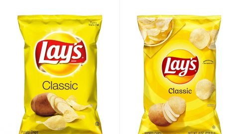
- Logos were nicely simplified: the new versions have fewer, more primary colours, simpler elements and far less gradients, giving them a flatter, more 2-D appearance. The approach is aligned with the evolution of design as packaging moves to make its best appearance in e-commerce.
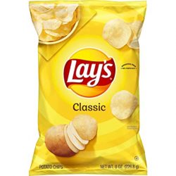
- The Lays logo makes less visual noise and the rest of the principle display panel can work harder to communicate the varieties. Lays have rethought the hierarchy of their design system: in it, classic flavours may seem a little quiet and stoic, but it will allow for a consistent execution of new line extensions and limited-time offers. Check out the new order of chips: from Wavy to Baked, Reduced Fat to Kettle Cooked and flavours from to Chesapeake Bay Crab Spice to Flamin’ Hot Dill Pickle.
- Lays photography does a lot to change this brand’s vibe. Chips scatter around the centered logo, shifting the visual power to the food and away from the brand. The photography is top-down: simpler and more accessible mimicking social media style.
- Kelloggs calls the new simplified Pringles logo a ‘glow-up’ of Mr. Pringle. The design goes ‘all in’ on this chip’s differentiator: stackability: illustrations of flavour – chilis, cheese and BBQ sauces are stacked with chips. With this new vertical design, there’s no mistaking this can, now also available in recycled material in many markets.
- Food is a star in social media culture and chips are part of the show. The new designs support Instagram-able ideas: chip pairings (or stacking in a Pringles world) and chips as side dishes. Limited time offers create more reasons for fame; in July 2020 Lays launched ‘Flavour Icons’, inspired by restaurants around the United States and in support of the pandemic-impacted restaurants industry.
Both brand designs took two years to complete, but have created new, lasting life in these classic brands.